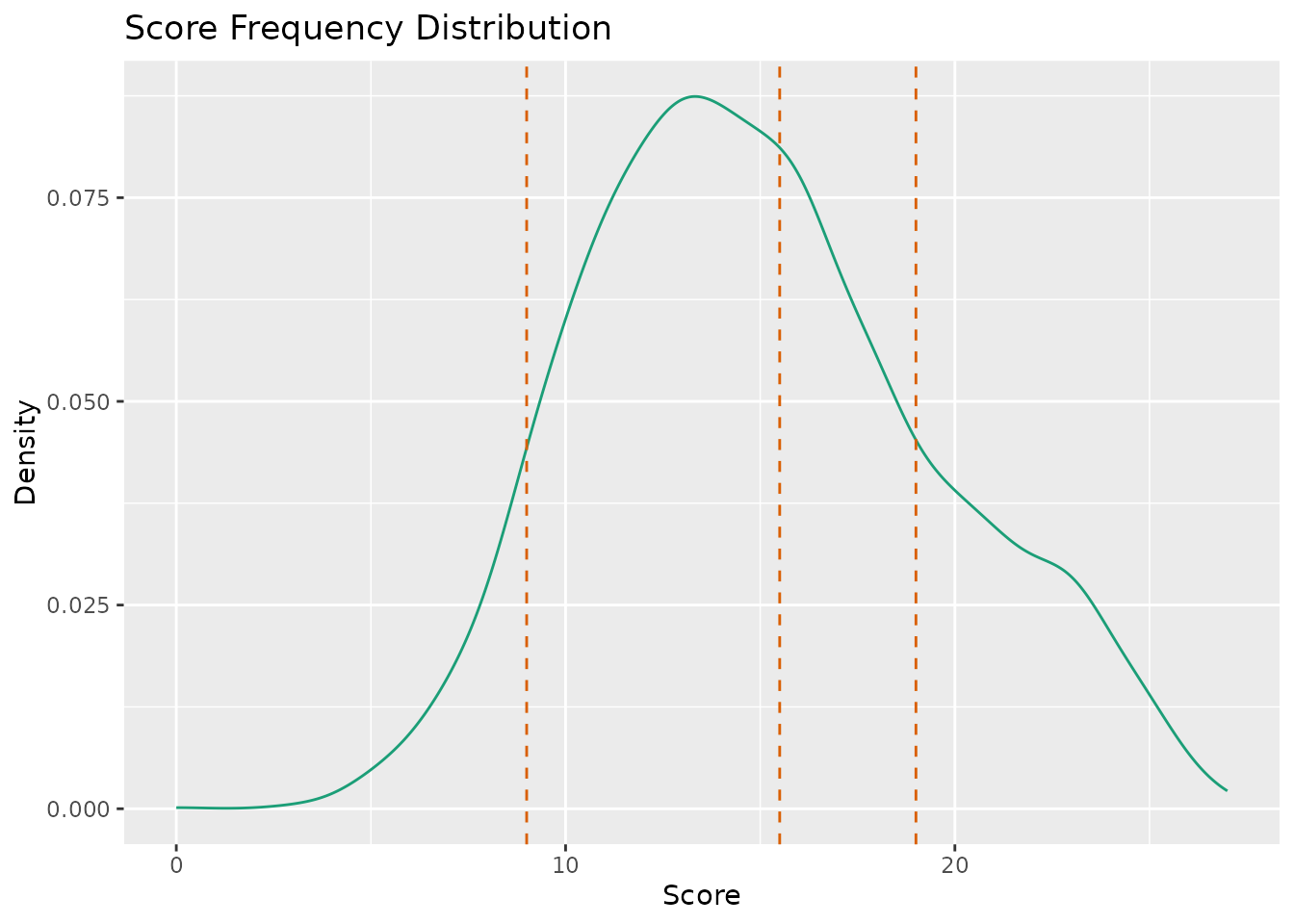
This function takes exametrika LRAordinal or LRArated output as input and generates a Score Frequency Distribution plot using ggplot2. The plot shows the density distribution of scores with vertical dashed lines indicating the thresholds between adjacent latent ranks.
Usage
plotScoreFreq_gg(
  data,
  title = TRUE,
  colors = NULL,
  linetype = c("solid", "dashed"),
  show_legend = FALSE,
  legend_position = "right"
)
Arguments
- data
An object of class
c("exametrika", "LRAordinal")orc("exametrika", "LRArated")fromexametrika::LRA().- title
Logical or character. If
TRUE(default), display an auto-generated title. IfFALSE, no title. If a character string, use it as a custom title.- colors
Character vector of length 2. First element is the color for the density curve, second is the color for the threshold lines. If
NULL(default), a colorblind-friendly palette is used.- linetype
Character or numeric vector of length 2. First element is the line type for the density curve, second for the threshold lines. Default is
c("solid", "dashed").- show_legend
Logical. If
TRUE, display the legend. Default isFALSE.- legend_position
Character. Position of the legend. One of
"right"(default),"top","bottom","left","none".
Details
The Score Frequency Distribution visualizes how student scores are distributed and where the boundaries between latent ranks fall. The threshold between rank \(i\) and rank \(i+1\) is calculated as the midpoint between the maximum score in rank \(i\) and the minimum score in rank \(i+1\).
This plot is useful for understanding how latent ranks correspond to observed score ranges.
Examples
# \donttest{
library(exametrika)
result <- LRA(J15S3810, nrank = 4, dataType = "ordinal")
plot <- plotScoreFreq_gg(result)
plot

# }
# }